Project overview
CLIENT:
True Link Financial
ROLE:
Product Development, Head of Strategy, Head of Design / UX
WHAT I DID:
Led yearlong product development process to build a new wealth management service for a mission-driven fintech company. Managed product strategy and design from concept to launch, aligned the executive team on business goals, conducted in-depth user research, developed the product vision, designed product visuals and hi-fidelity wireframes, and oversaw the marketing and brand strategy for launch.
SKILLS & METHODS:
Product management
Product strategy
Design
User research
Competitive analysis
Brand strategy
Content strategy
Interviews
Surveys
Executive alignment
Usability testing
Challenge
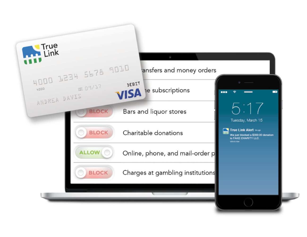
True Link is a financial services company that protects the well-being and independence of seniors and adults with disabilities. Founded in 2013, the company first launched a customizable Visa debit card built to prevent elder financial abuse. With this flagship product, an attorney, professional guardian, trustee, or family member could act as an administrator of the card on behalf of a senior and limit spending to safe categories or vendors via an online dashboard.
While the True Link Card gained a loyal following thanks to its unique technology, customizable controls, and applicability to a broad range of use cases, the company faced considerable challenges in scaling its approach. Namely, the number of seniors willing to grant fiduciary oversight to a card administrator — even if it meant being protected from scams and fraud — was not as large as anticipated.
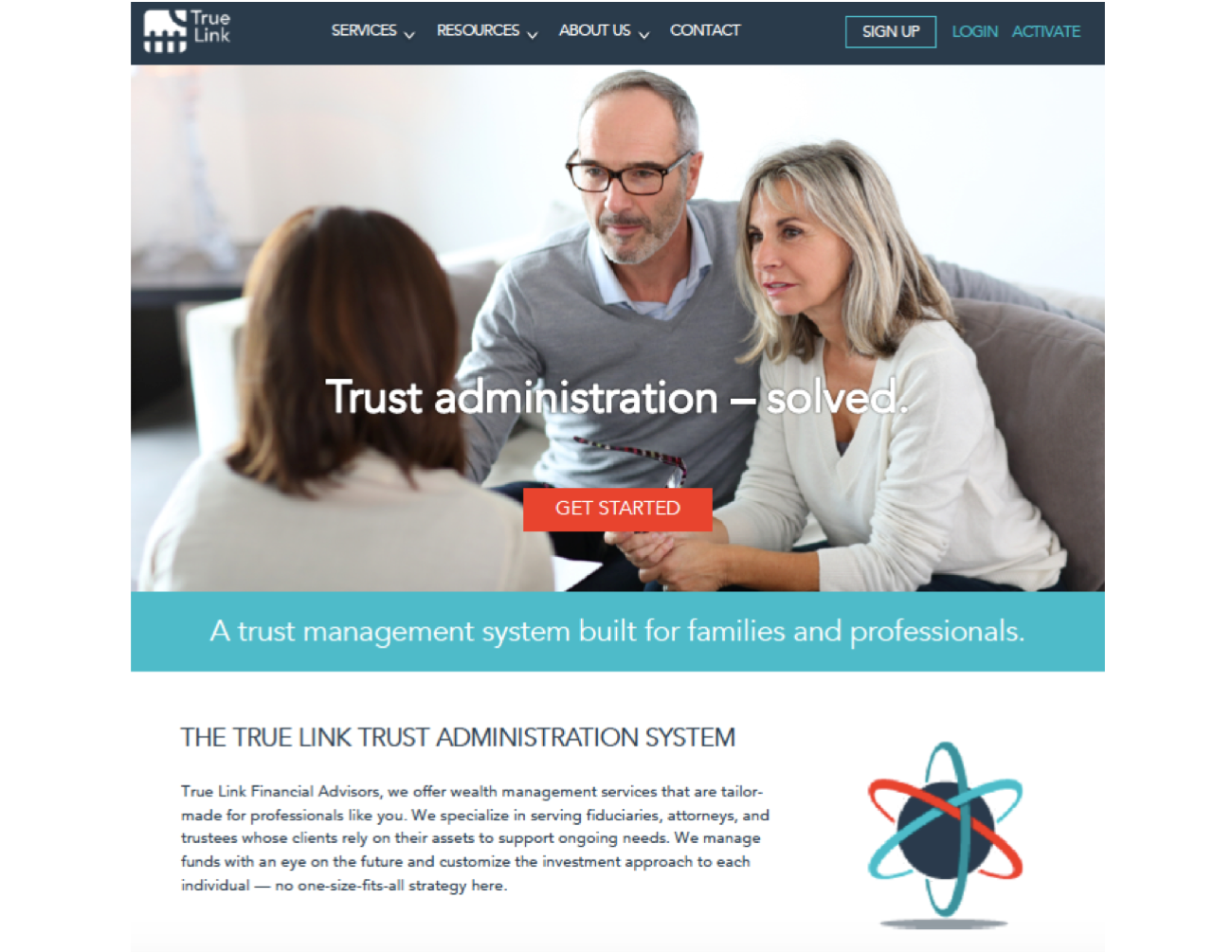
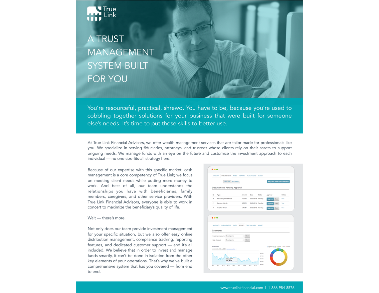
In order to grow the company, we considered adjacent services that would not only benefit our existing customers and build on our hard-fought brand integrity, but would also unlock greater market potential. We first expanded into trust management, developing an investment management system with disbursement, reporting, and compliance functionality. This was a natural extension of our card product and quickly piqued the interest of special needs trusts. However, it became clear this would not be enough to achieve the scale we hoped for. We needed to think bigger which, ultimately, led us to consider consumer wealth management for those on the cusp of retirement.
Defining business goals
In early 2016, I worked closely with True Link’s CEO, COO, and Head of Wealth Management to define our longer-term vision for the company. This set the stage for the forthcoming product development process and ensured that any new service would directly support our overarching strategy. Through these conversations, we decided on three business goals.
Considering these goals — as well as our existing customer base, brand, and technology — we decided to move forward with our most promising idea: a consumer wealth management product specifically for seniors. While this direction seemed right, we first needed to answer some key questions. Who was our target customer? What essential problem was he trying to solve? Why weren’t current products meeting his needs? What frustrated or scared him? How did he perceive the existing world of financial services? With this in mind, I launched the first phase of our product development process: research.
Understanding the market
I started with a deep dive into the competitive landscape of investment services. Here, I provided the team with a foundational understanding of competitors, market trends, and existing products.
Competitive landscape
I mapped out key players and identified their visions, values, niche markets, strengths, and weaknesses. This included members of the old guard, as well as startups and innovators in the financial services space. Additionally, I approached this research as a potential consumer and met with three companies to discuss investment recommendations for an older couple (my parents). This gave me insight into different investment methodologies, positioning, and sales pitches.
Market trends
I looked closely at contextual factors and trends affecting the market, such as aging demographics, federal and state regulations, heightened interest in fiduciary duty, robo advising, and new operating models. I reviewed white papers, financial blogs, surveys, and analyst reports, and interviewed industry experts. I also spoke with True Link’s B2B customers to get their perspectives on emerging themes.
Product and service offerings
I examined a range of products and services, with a focus on those geared toward seniors. In conducting this analysis, I compared pricing, investment methodologies, and service models. As someone with no professional background in wealth management, this research acted as a crash course in everything from ETFs to bond ladders to asset allocation algorithms. True Link’s Head of Wealth Management acted as my guide to the world of financial services, patiently explaining concepts until they really stuck.
Understanding user needs: Interviews
To help the team understand and build empathy for our potential users and anchor our product strategy on real user needs, I dove into my next three phases of research: phone interviews with retirement-age adults, in-person interviews, and a robust national survey.
Phone interviews
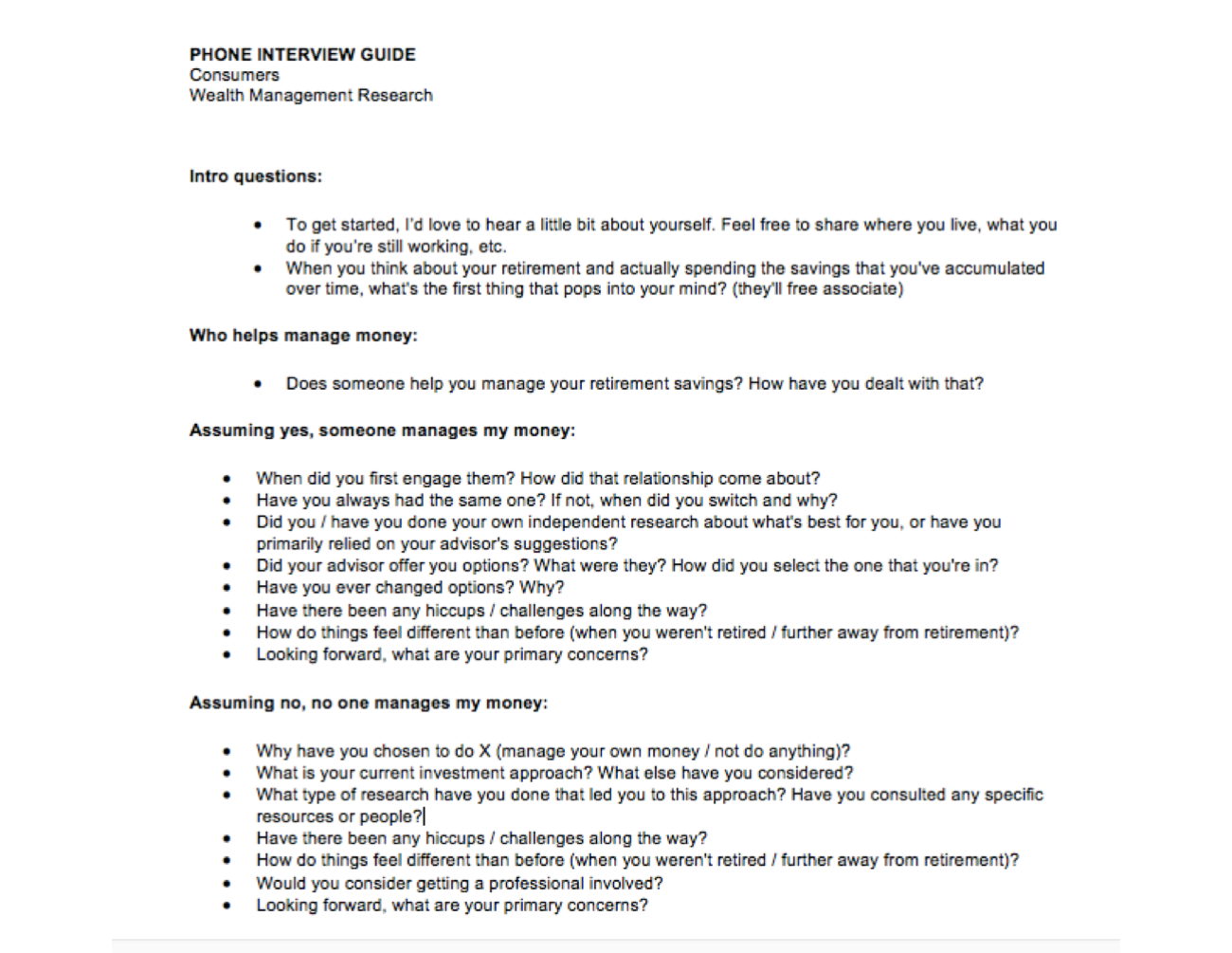
I first conducted 45-minute phone interviews with seven adults aged 55 - 71. These individuals ranged in terms of retirement status, amount of money saved, attitudes towards aging, and investment preferences.
I identified candidates via friends, colleagues, and family members. This research served as my starting point for understanding user needs, testing early assumptions, and building hypotheses for our product vision. During the calls, I asked interviewees about their fears around money and aging, financial goals, approaches to saving and investment, and attitudes towards their current financial advisors.
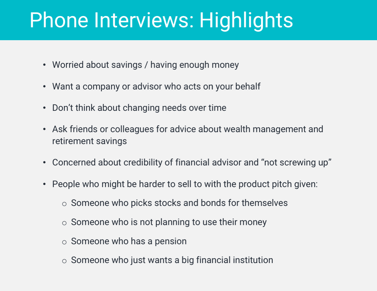
The conversations proved telling. Interviewees expressed deep worries around getting older, having enough money, investing assets correctly, and making the wrong decisions. I noticed that even in talking to me — a casual, low stakes conversation — individuals felt a need to apologize for their perceived failures. One woman stated, “I tried to think about why I haven’t dealt with my finances. I don’t want to see how much we’ve lost in the stock market. I guess I really don’t know what I’m doing. When I think about needing money after retirement… I just wonder if it’s too late.” Others expressed a profound lack of trust in advisors and a sense of helplessness in knowing who to turn to. One man angily remarked, “You can’t trust anyone. They just want to make a commission. All those companies are structured to act in their own interest. What am I supposed to do?”
With this initial data, I began to define the “job to be done” — the critical issue our product would need to address — as well as a potential customer profile. After synthesizing my insights in a report for True Link’s leadership team, I used the questions that surfaced among the team as the basis for my next round of research.
In-person interviews
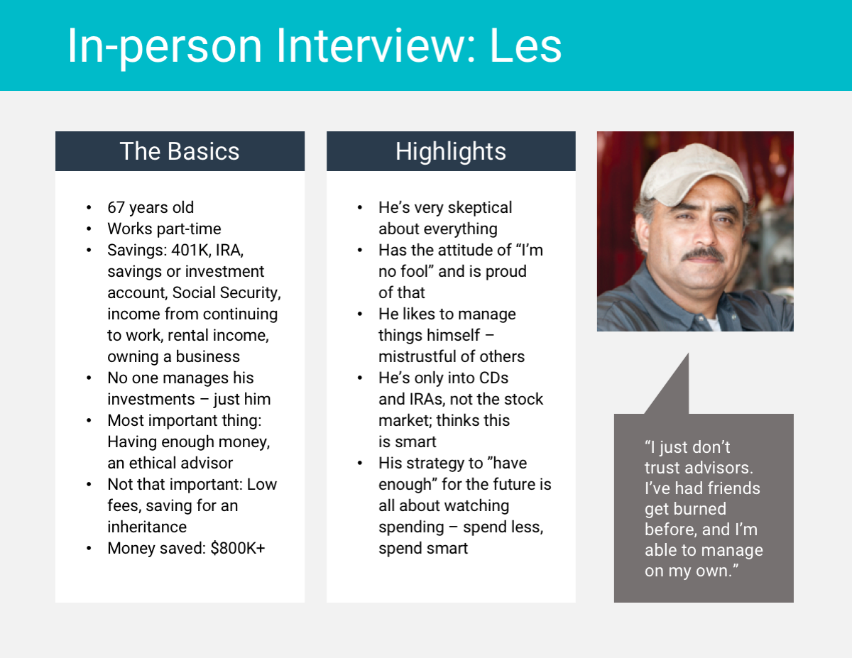
Next, I conducted in-person interviews. I wanted to test our early thinking, observe both verbal and non-verbal responses, and encourage subjects to “think out loud.”
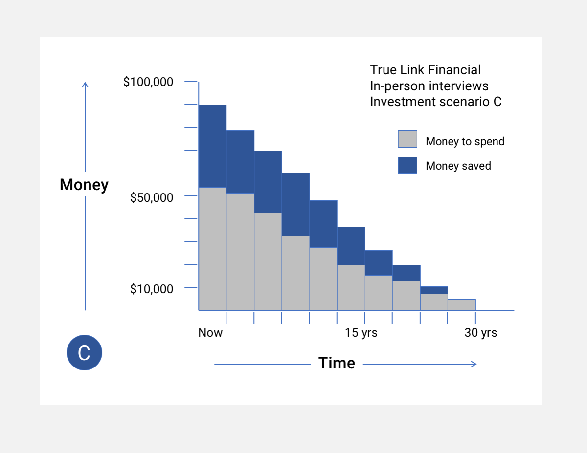
Using Craigslist as my recruiting tool, I selected five adults aged 55 - 67. Each had varying levels of retirement savings and some managed their own investments, but all indicated that they valued having enough money to last for the rest of their lives. During the sessions, I asked for them to react to specific investment scenarios, probed what having “enough” money meant to them, and inquired about their personal spending and saving strategies. The reactions I received were anything but dry.
Josie, a 61-year old woman who had spent her retirement savings trying to support her son struggling with addiction, burst into tears. “Honestly, I’m just trying to make it to tomorrow. Is it even possible to start over? I don’t know.” Ed, a 55-year old active self-investor, was eager to share his skills, yet seemed hung up on one major misstep. “The first thing I do when I wake up is check the market. The last thing I do before bed is check the market. I live and breathe this stuff. I’m a natural. I understand when to buy and sell. If I just hadn’t sold during a downturn that one time… lost thousands. So stupid.” Mike took great pride in sharing his coupon-cutting strategies: “Susan and I never buy unless it’s a deal. We’ve done this for years. You know how much we’ve saved? $600,000. And I don’t invest that in stocks — no, no. Too risky.”
Each conversation allowed me to test our emerging vision and flesh out user pain points and needs. After sharing these findings in a presentation to the CEO, COO, and Head of Wealth Management, I was ready to test our theories on a broader scale.
Understanding user needs: Survey #1
Overview
By this stage of the research process, I had developed a working perspective on the product opportunity. In gathering data via a national survey, I hoped to finalize our vision and move on to the product design phase. My survey objectives were to: 1) Confirm user needs and pain points; 2) Better understand how seniors currently manage their retirement savings; 3) Identify key variables in the product experience; and 4) Refine our working value proposition, which would attract both consumers and media.
Process
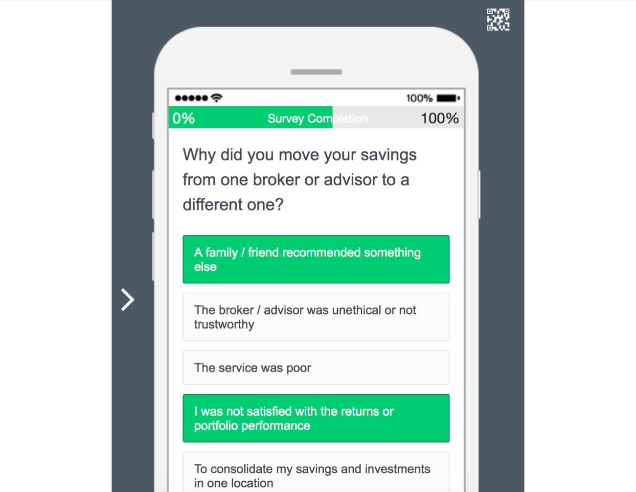
I designed the survey thinking carefully about flow, length, limiting bias, and clarity. I imagined different data cuts I could make based on the demographic breakdown of respondents, as well as how I might build use cases. I wanted to set up a survey that would give us the best data for future analyses. Additionally, I wanted to help us understand not just the “what,” but also the “why.” After sharing a first draft with the team, I gathered feedback and made refinements.
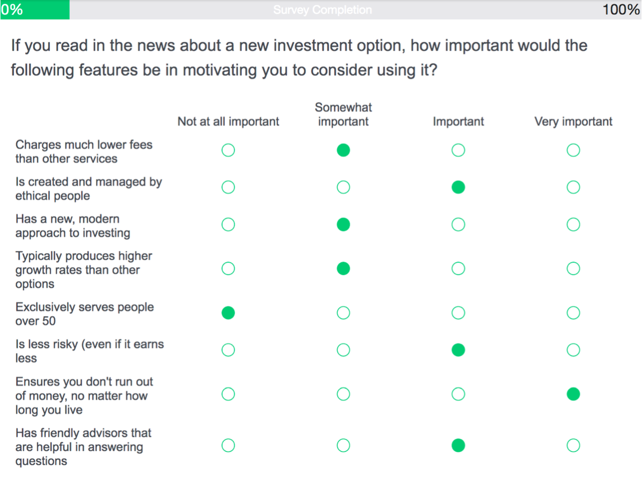
I programmed the survey in Qualtrics, using “display logic” settings and piped text to simplify and personalize the respondent’s survey experience. I used clear and precise language, avoided leading questions, and chose question types that would give me insight into relative preferences and intensity of attitudes. After testing the survey with the help of teammates and former research participants, I was ready to launch it.
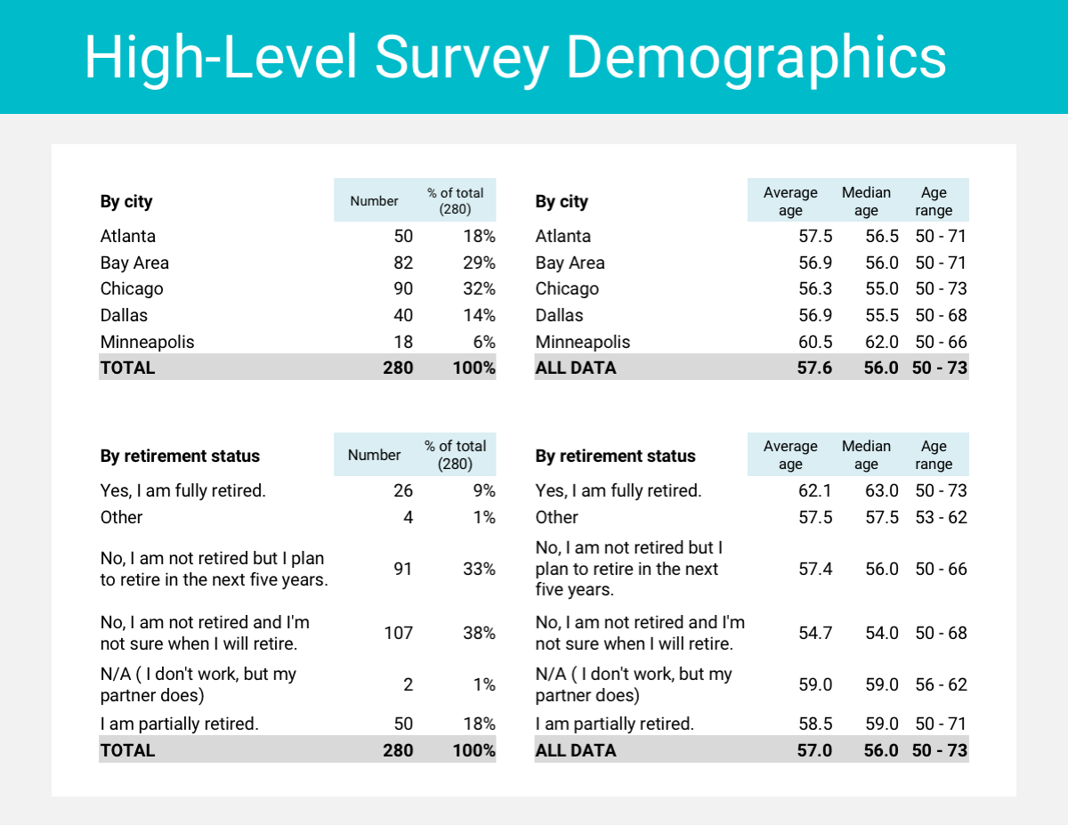
Given True Link’s limited budget and agile approach, I shared the survey via quick, easy, and accessible channels: Craigslist, social media, and partnership channels. I offered a financial incentive to attract interest, and screened respondents based on age, location, retirement profile, and level of savings. After scrubbing the data, I counted 280 valid responses.
Analysis and insights
I used several methods of quantitative analysis, such as descriptive statistics, t-tests, and analyses of variance, to determine user preferences and to find differences between groups. I also used inductive comment coding, a process of analyzing open-ended text responses to identify patterns, desires, behaviors, and pain points. Five major themes — or potential value propositions — emerged (see image).
While we had hoped this survey would help us finalize our product vision, we needed a more nuanced understanding of the five themes in order to prioritize features, build a roadmap, and shape the branding for this new service. I prepared a second national survey.
Understanding user needs: Survey #2
For the second survey, I focused exclusively on the five emerging value propositions. I wanted as much depth and detail as possible, aiming to get insights that could drive our product vision and positioning. My survey objectives were to: 1) Understand how older adults view and prioritize the value propositions, 2) Understand how older adults talk about these themes in their own words, 3) Test nuanced versions of the value propositions, and 4) Develop a strong point of view on key product features.
Process
In drafting questions and designing the second survey, I followed the same process as before, but focused on open-ended questions to prompt respondents to imagine solutions, tell stories, and share concerns and motivations I hadn’t considered.
Again, I used Qualtrics to program the survey, and distributed it nationally via the same channels. After screening out irrelevant and incomplete responses, I had a sample size of 161 responses.
Analysis
As with the first survey, I conducted the same quantitative analyses (e.g., t-tests, ANOVAs), taking into account the limited sample size. I also looked at standard deviations to determine the spread of opinions and see how we might be able to move the needle. Again, I relied on a manual, inductive coding process to limit bias and, depending on the question, I used a flat or hierarchical coding frame, focusing on flexibility, coverage, contrast, and sentiment differences. Throughout this iterative process, I read samples, cleaned and sorted data, coded, reread, and recoded. I manually coded nearly 1,400 comments, which enabled me to improve accuracy, limit redundancy, and get the right level of granularity for our needs.
Insights
The data highlighted two new, universally-desired themes — access to trusted information and control — and revealed a cross-cutting desire for a service that always acted in the best interest of the client. Respondents wrote about ethics and accountability with passion, but were skeptical about trusting financial institutions. As one respondent noted, “I want a service that deals with facts, not opinions. Take the personal out of it and replace it with quantitative tools that have no dog in the hunt.” To score well across credibility, uniqueness, and value — and to nail the value proposition — we needed to bake the concepts of "money forever" and "modern / analytical” into our product and messaging. If True Link could build a product and brand that embodied these values, we would have a real competitive advantage and a shot at transforming the space.
Armed with these insights, I prepared a report summarizing all of my research and recommendations. We were ready to articulate our product vision.
Putting it all together: Product vision
The executive team met to review the research, discuss my recommendations, and decide on a cohesive product vision that addressed both business and user needs. Here, I led the conversation to define the market opportunity, target customers, value proposition, key product features, and how we might differentiate our service from competitors’.
At a high level, we agreed to focus our product on older adults (55 - 75), prioritizing those on the cusp of retirement. The product would address the financial and emotional needs of retirees through technology and brand innovations. In particular, we would build an investment approach and tooling that would use algorithms, modern portfolio theory, and a mix of investment products (including annuities) to help make money last. Additionally, we would build a brand and service model that emphasized ethical practice and trustworthiness at every turn. We would become the best-in-class investment model for retirees living primarily on a fixed income.
With a shared vision in place, the team then worked on an agile product roadmap with strategic themes and features. My next focus would be product design for a web-based platform and online tool.
Product design + testing
Challenges
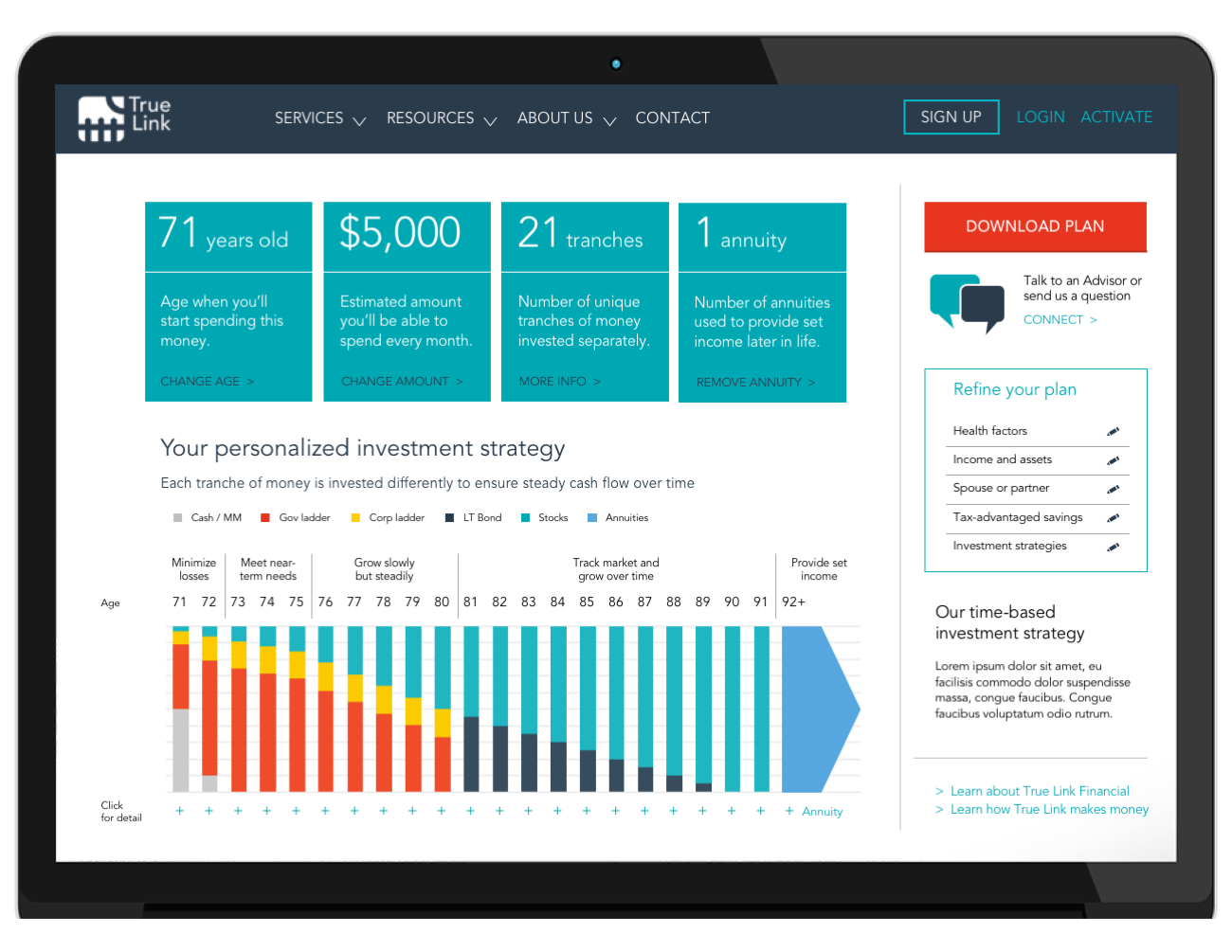
For the design process, I faced several notable challenges. First, our wealth management and engineering teams were developing an investment methodology from scratch, so I would need to work closely with them and update designs on an ongoing basis. Second, the emerging methodology was proving to be incredibly complex; I would need to figure out a way to visualize abstract concepts for our clients. Third, given our brand goals of honesty and trustworthiness, I would need to present financial data in a transparent way without overloading the user with information.
Design and usability audit of competitor products
As the engineering and wealth management teams locked down the methodology, I started the design process by conducting a visual design and usability audit of competitor products. I broke down my observations into several categories: user flows, portfolio visuals, layout, content, and overall experience. This helped me understand what users might expect from a financial services tool, as well as the limitations of existing offerings.
Sketches, wireframes, and site map
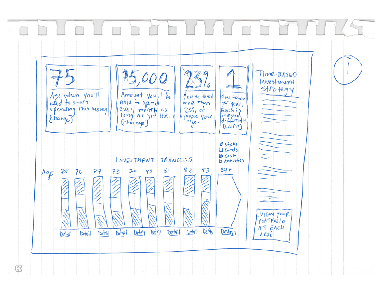
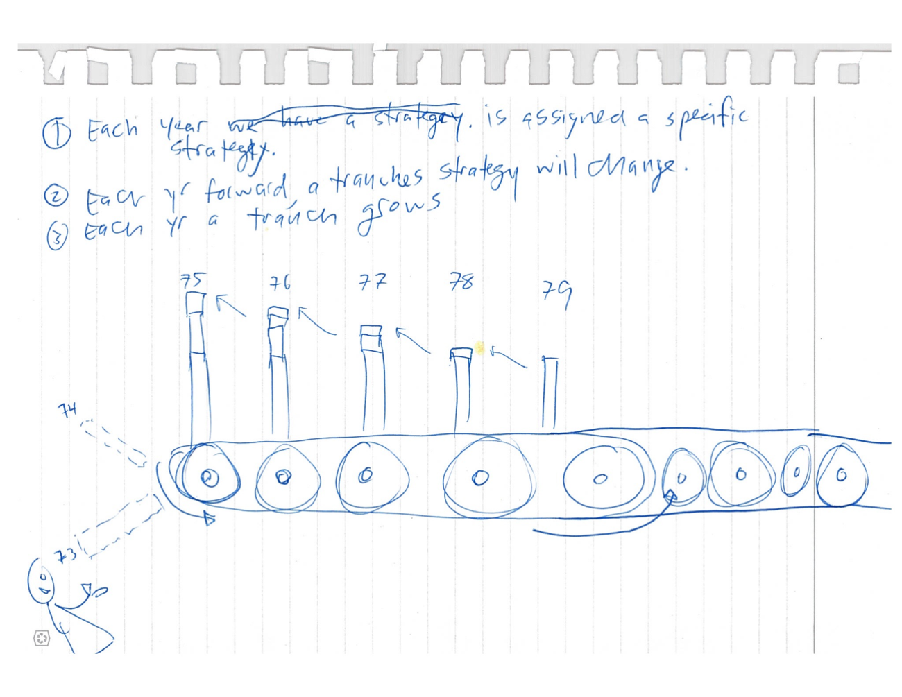
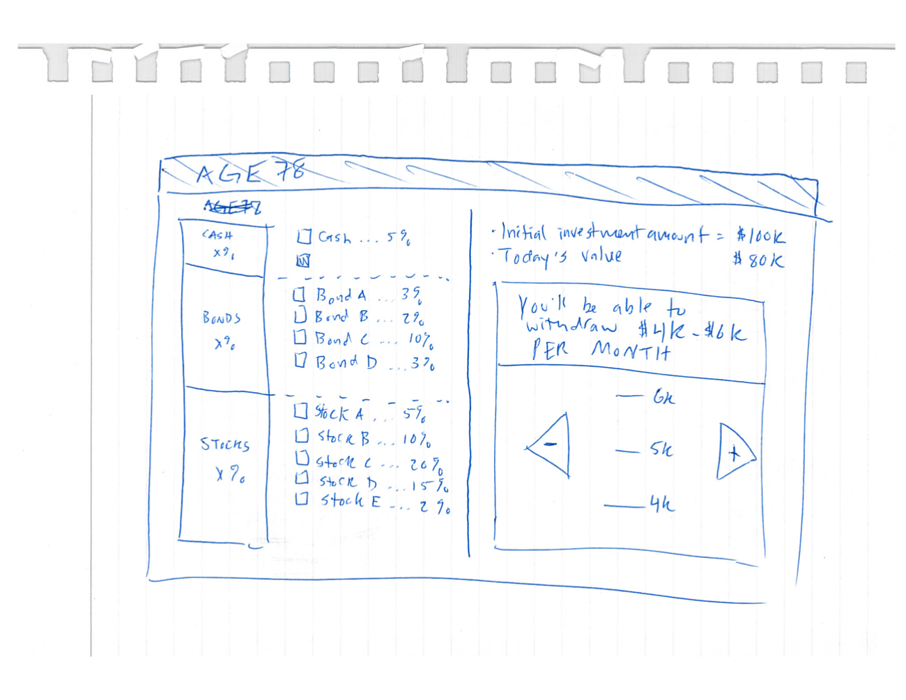
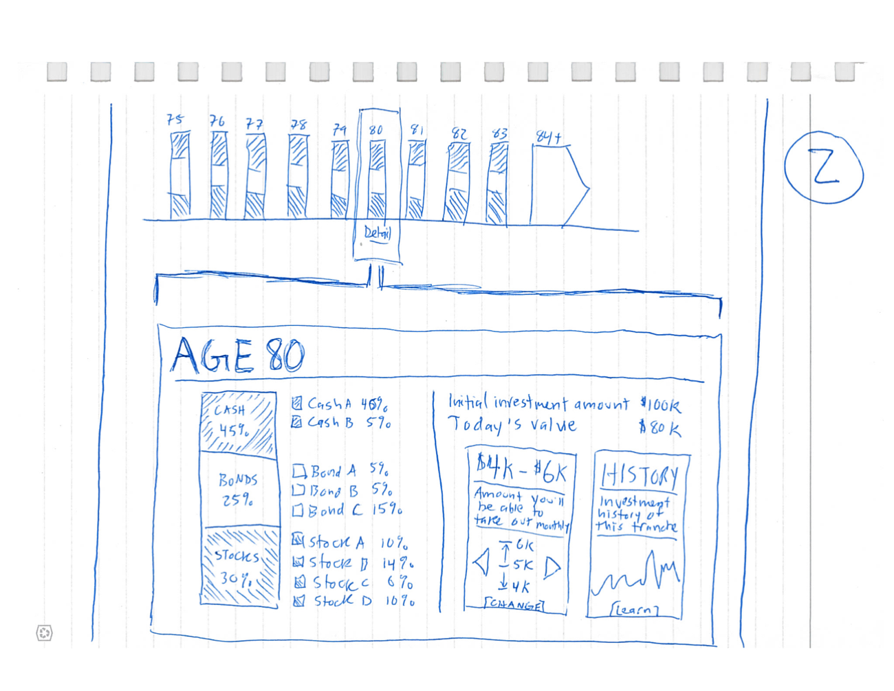
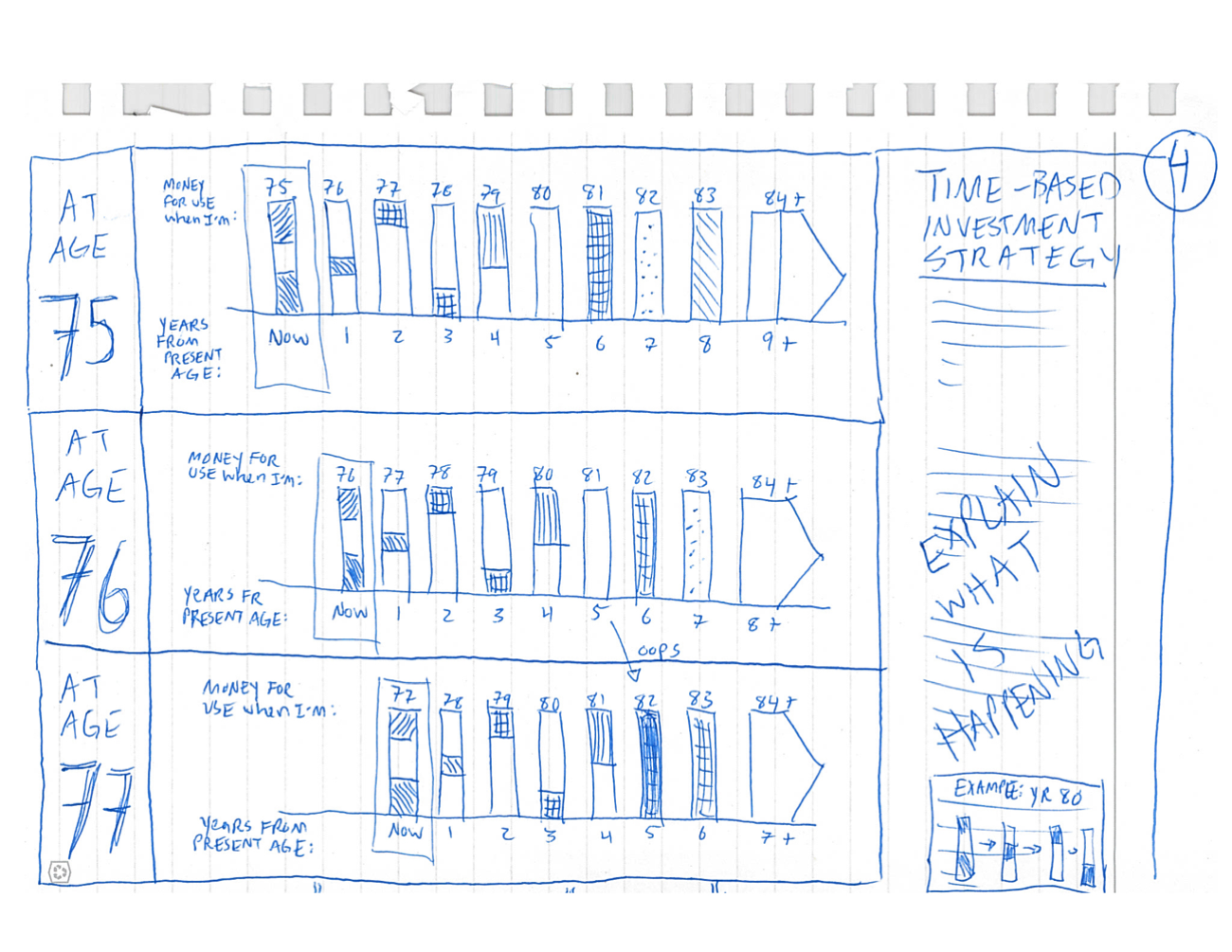
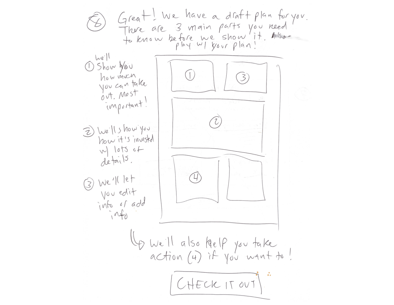
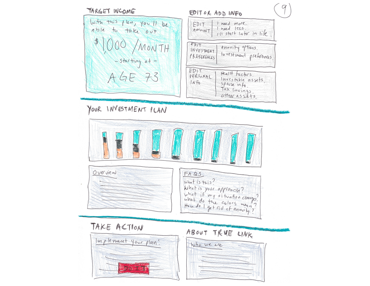
I wanted to anchor our design on the fundamental concept of “having enough money for as long as you need it,” the framing that our value proposition and product differentiation relied on the most. I drafted dozens of sketches, trying out visual metaphors — for example, runners in a race or conveyor belts — before landing on something more diagrammatic. As my design language began to take shape, I mocked up low fidelity wireframes for anticipated pieces of the site.
Once the team had decided on an investment methodology, I mapped out elements of the user journey, drafted a site map, and quickly moved from low to high fidelity wireframes. While this approach isn’t always ideal for a large cross-functional team, it worked for our agile environment and, because I had led our user research and developed our product strategy, I was able to make decisions with confidence. What’s more, because I had led a full brand refresh and website redesign earlier that year, I had the brand standards and creative vision needed to hit the ground running.
Content
As True Link’s resident content strategist, it was also my responsibility to draft all product content. This included explanations of our methodology, investment FAQs, tooltips, CTAs, and more. I worked closely with True Link’s CEO, COO, and Head of Wealth Management to refine the copy and ensure clarity.
Feedback and usability testing
With initial wireframes completed, I gathered feedback from the team and made changes. This was an iterative process, which both informed and responded to ongoing feature revisions. In particular, we spent much of our time refining the interactive depiction of a user’s portfolio, which proved to be the trickiest — and most essential — information to communicate.
At the same time, I worked closely with our engineers and front-end developers to translate my visual designs into a working prototype. This enabled our team to conduct usability testing and get initial product reactions. I developed a test plan, defined tasks and drafted questions, recruited five participants that resembled our target users, and moderated sessions. While reactions were largely positive, participants expressed confusion at specific points during the user journey and struggled with interpreting the homepage graph. Based on what we learned, we redesigned our user tutorial feature and made other adjustments through the launch date.
Prepping for launch: Marketing
As we sprinted toward the product launch, I helped the team develop and implement a marketing strategy to attract consumer and media attention. Here, I led our work around messaging and asset creation.
Messaging and positioning
To finalize our launch messaging, I conducted a final survey of existing customers to test our language and the value of these new features. This resulted in some critical last-minute edits. I workshopped talking points with the executive team, synthesizing our most salient messages into clear, punchy phrases. I took our complex investment methodology and boiled it down into simple, yet intelligent, feature descriptions. I drafted all FAQs, which covered a range of topics from security and account management to investment specifics, with a focus on clarity and transparency. Finally, I trained the broader cross-functional team on what we had created and prepared sales and CX for action.
Assets
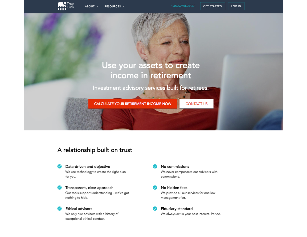
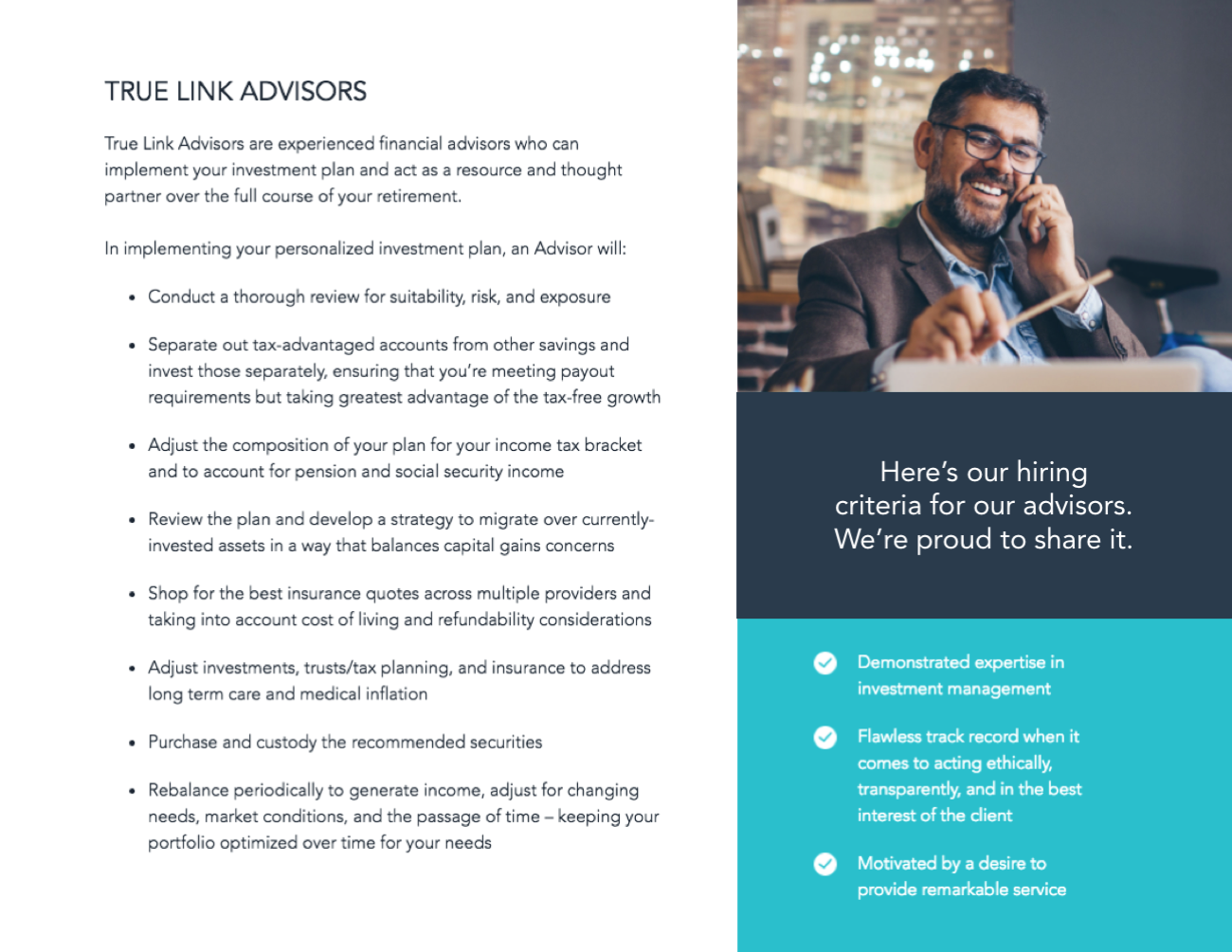
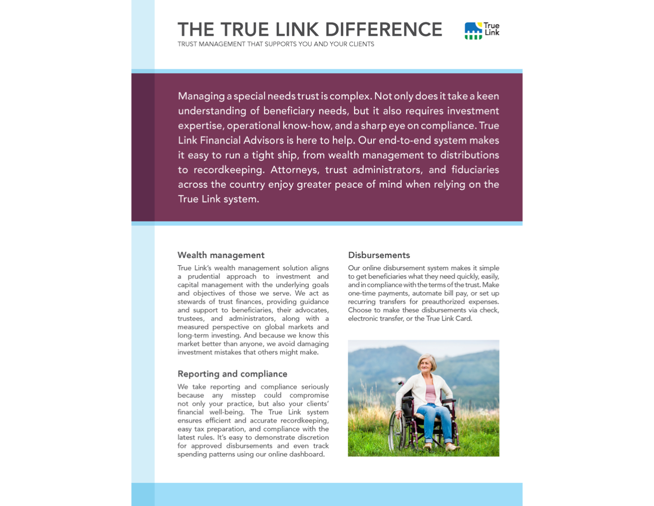
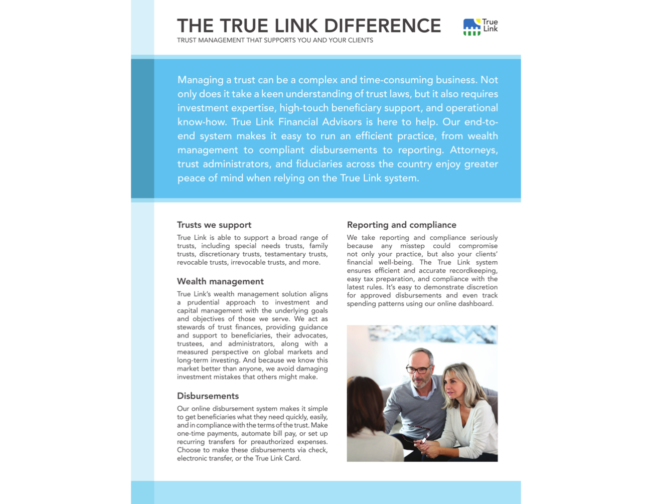
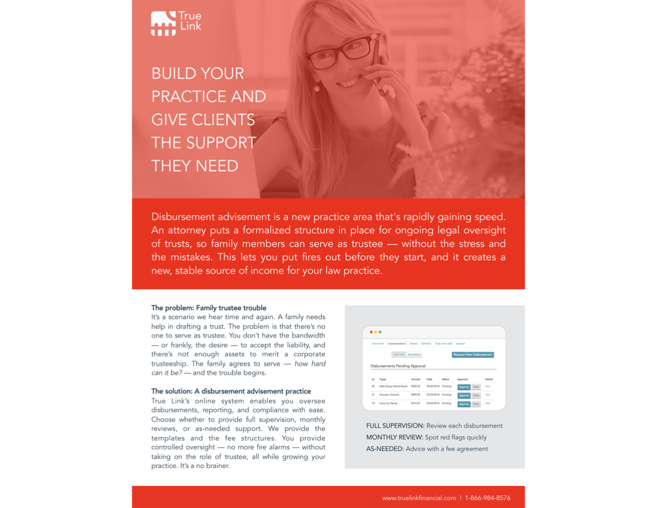
I led our content and design work to create print and digital marketing assets for the launch. I drafted blog posts that highlighted what made our product different and better than our competitors’: our use of annuities, unique methodology, and product relevance given the Division of Labor’s new Fiduciary Rule. I created an animated video that visualized our investment approach for retirees. I designed and wrote new brochures and handouts. And most importantly, I redesigned our website to highlight our new service. For this, I oversaw the creative direction and led all aspects of the redesign process — information architecture, interaction design, visual design, and content creation.
Impact
This yearlong effort to identify and build a new offering at True Link changed the course of the company. With our new consumer wealth management product for retirees, we significantly expanded the company’s vision and market potential, all while preserving our initial values and maintaining relevance to early customers. The wealth management product received favorable press (e.g., Forbes, Barron’s, Venture Beat, The Economist, Kiplinger), and this successful launch helped the company raise $8 million in Series A funding in 2017.
